
Propelled by the energy of the capital city fans, PWHL Ottawa played an electrifying brand of hockey in its inaugural season. Now the power-packed team is leading the way as the Ottawa Charge.
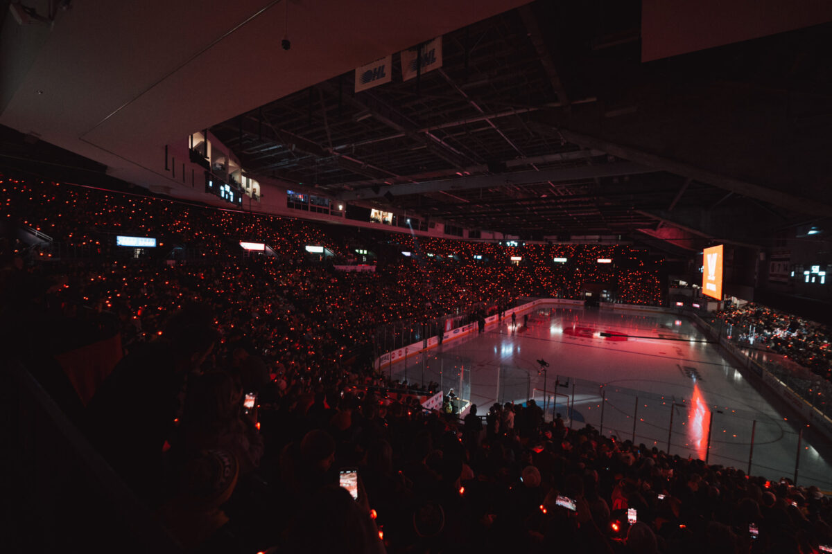
Leading the way is just what you do in Ottawa, and it’s just what the city’s PWHL team and its hockey fans did in the team’s first-ever contest, setting the world record for the largest crowd ever for professional women’s hockey, at that time. Each of the 8,318 fans at TD Place arena in Lansdowne Park that January evening amplified the other’s energy, creating an electric atmosphere and inspiring the Ottawa squad to press forward. “I don’t think I’ve had chills like that—ever,” recalled team captain Brianne Jenner, who’s earned three Olympic medals, including two golds, to the refrains of “O Canada.” “To skate onto that ice for the first time and to feel the energy from the crowd…That moment I’ll never forget.” The team returned the favor with their electrifying play, rallying a fanbase that led the PWHL in attendance in its inaugural season. In March, a whopping 13,736 fans turned out to see Ottawa play a neutral-site game against Boston in Detroit, setting a new attendance mark for women’s professional hockey in the United States. This squad leads the way wherever it goes, inspiring its hockey fans and city to reach new heights. Just like Ottawa’s motto: “Advance – Ottawa – En Avant.”
Now the team is leading from the front, with every shift and every rush, propelled forward by a high-powered new name. Here comes the Ottawa Charge.
The inspired, and inspiring, name identity was revealed live on Breakfast Television by Jayna Hefford, the PWHL Senior Vice President of Hockey Operations. What the Hockey Hall of Fame inductee observed in the team’s first season sold her on the Charge name. “It was a new market,” she says, for the PWHL and professional women’s sports. “We really didn’t know what to expect.”
That intensity took multiple forms, all of which fed into the team’s new identity. “Ottawa leads as the seat of power in the country,” says Amy Scheer, the PWHL’s Senior Vice President of Business Operations. “Their fans also led the way in overall attendance.” The team pioneered a post-game ceremony dubbed the Thunder Clap, in which players circle up mid-ice to applaud fans with a single mighty overhead clap. “They were the first to bring that sort of ritual into the arena,” Scheer adds. “It’s another way Ottawa has led the charge.”

After playing the inaugural season without a traditional team name, the league set goals for Ottawa’s new identity: It had to be distinctive, easy to grasp, proud, and built to endure. Most of all, the name had to connect deeply with its home. “The core of our effort was to capture Ottawa’s spark and authenticity,” says Kanan Bhatt-Shah, the league’s Vice President of Brand and Marketing, who oversaw the league’s naming process. “The city represents progress and power in a uniquely Ottawa way.”
To have each squad’s name identity ready for season two, the PWHL enlisted Flower Shop, a New York-based creative agency to assist with the name and visual identity development. Together, they embarked on an accelerated process, completing a project that often takes sports teams two years in less than one. “We had a deadline,” says Flower Shop’s co-founder and Chief Creative Officer Alastair Merry. “But we took the time, care, and craft to get this right.”
Before the creative inspiration came the perspiration, as research and inaugural season insights-gathering laid the foundation for all naming to come. Basking in the players’ intense, electric presence on the ice and the power unleashed in the stands, conducting interviews and analyzing every type of sports team name in Ottawa (and beyond) served as the bedrock for naming this forever forward team.
Once a list of strong potential names was developed, a rigorous intellectual property clearance process resulted in any name with a possible trademark conflict being removed. However, much to the group’s joy, one name raced ahead – and thus, the Charge was born.

The moniker had stuck with Merry since he took in his first game at TD Place. “You could feel the fans moving the team forward,” he recalls, “and the team moving the fans forward. It felt like a constant charge in there, and that’s what we kept coming back to. The Charge—that says it all.”
The name spoke volumes, and the league’s leadership agreed. “It could mean leading the charge, it could mean being charged up, it could mean multiple things,” Scheer says. “But at the end of the day, I think it’s the energy of Ottawa.”
Combining the various aspects and meanings of Charge into a single graphic was no easy feat especially since the logo has to power numerous applications: signage, scoreboards, and screens—where the emblem would need to be animated—not to mention merchandise, including tees, hats, and jerseys.
After nearly 100 designs, the Flower Shop creative team arrived at the team’s surging logo: a monogram “O” crafted to resemble an ever-spinning ball pulsing all around with electric currents representing both the team and its fans. Spark-like spikes trail the seemingly speeding graphic, angled to show its forward movement. And a faceted cut, reveals the letter “C” framed within the “O”, uniting both the Ottawa Charge’s initials in a single propulsive visual.
The graphic and visual entity as a whole is anchored by a bold, bright red that radiates intensity and passion. That dominant color is complemented by a trio of grays, ranging from deep charcoal to lighter steel, an arctic white, and a dynamic pop of yellow. The wordmark and typography are powered by Proxima Nova, a clean, modern font whose angled italicized forms create a sense of motion.
![]()
That was fitting for a team on the move. After competing for a playoff berth until the final game, Ottawa hopes to carry that momentum into its second season. “They were physical, they were skilled, they did all of those things that made it for entertaining hockey,” Hefford says. “Then, when you factor in that connection to the fan base and the atmosphere, you get that electrifying experience.”
That collective power of the fan-player exchange immediately drew General Manager Mike Hirschfield to the ‘Charge’. “I love this name,” he explains, “ because it represents the energy of our fans and the charge that our players feel. The passion our fans brought inspired our players to the highest levels of performance.”
Erin Thompson, Director of Team Business Operations, adds “The name Ottawa Charge defines our team. It is the best way to describe the electricity that ignites in our building when our fans arrive: the explosion of chants, cheers, energy and pure joy that light up TD Place during our games.” Among the many advantages of the Charge name is its ability to instantly inspire new in-arena chants, signs, and slogans. Rest assured, Ottawa fans will take it from there. It should come as no surprise that the PWHL’s smallest home market led the league in attendance. This is the city that played host to the first recorded game of organized women’s ice hockey in 1880—it has always led the way.
The difference now is that Ottawa is revved up and racing forever-forward powered by the Charge.